Thursday, 25 April 2013

Alien Head Texture

Week 10&11
Our last task for week 10&11 was to texture an alien head sculpture, sculpted in Zbrush.
This time we didn't use Photoshop for textures, what we were supposed to do was  polypaint the mesh in Zbrush. When I first saw the alien head sculpture, my first thought was that it look like a shark, I fancied that it was from a planet that is covered by water and that it lives deep in the oceans. 
So having the that in mind I looked up some reference of sharks and started my vertex painting. After that I used ZApplink, which grabs a screenshot directly from Zbrush and opens it in Photoshop. Then there I can use that to add textures to my mesh and make it look more realistic. After I was done with that I saved the file returned to Zbrush and it automatically imported the changes I did to my texture in Photoshop.
I also used another method, I sourced textures from the internet, imported them into Zbrush and painted them onto my mesh directly. I sourced a crocodile armor and applied it on the top of his head like he has a hard shell for protection.
It looked nice, but I wanted to add more detail to it, so I sourced a frog skin texture and applied it beneath the crocodile armor.
I add a bone texture to the teeth just so I could add some detail and more definition to the teeth.
After I was done with adding textures to the mesh I used another function in Zbrush called project manager. I used project manager to add some highlights to it giving it a more realistic look. With this I was finished with my polypainting and all I got left to do was bake my diffuse, normal map and ambient occlusion from the hight poly mesh's I exported from Zbrush to the low poly mesh in Maya.
I was finished with the baking, added the texture to the low poly mesh and decided to render my final work in Maya. However, before I did that I decide to try something out. I made a copy of the eyes and scaled them to make them a little bit bigger, turned down the transparency, worked around with the specular for it and the final result was that I got lenses. I did that to add more specular power to the eye and make them look realistic. So after doing that I started rendering in Maya and I did that so I could try something new and also get a better understanding of rendering and lighting in Maya.
This is the final render I made for this task.

Wednesday, 17 April 2013

Building Texturing

Week 8&9
In this post I will show and explain how I work through my task, which was to texture a cottage.
On week 8 our task was to texture the door for the building task, because we were shown some new methods we could use for this task. In Maya we had a high poly and a low poly version of the door. I used the high poly mesh to bake a Normal map and an Ambient occlusion, so I could after that apply it to my low poly model. All my bakes I did in Maya, because Xnormal was giving me some problems with the results of the bakes. Also to ovoid overlapping I baked each item separately and we I was finished with that, I exported the UV's and started texturing. I then sourced a wood texture and covered the pillar and arch of the door. However, later on I'm going to apply some ornaments and patterns to the pillars, that's why I needed distortion free UV's for the pillars, because there will be seams on the corners.
I went back into Maya, duplicated my mesh and made a UV projection with camera planar in perspective view, only for the pillars. I assigned a wood texture to it and placed it so that the seams were covered. After that I selected my original mesh, opened Transfer maps, used the duplicate as my source mesh and baked an Diffuse map for it.
The result was pretty funky, but the parts I was interested in were the seam areas of the texture, I removed everything else and layer this above the base texture. After this  I got a seam free texture.
After that I sourced some celtic ornaments and scaled it to fit the arch and pillar. I set the Fill to 50% and turned on the layer fx inner shadow. After that I added a wood texture to the door and to give it a bit of a worn look I duplicated the layer and set it on Multiply to make it a little bit darker. I applied a texture for the door handle and for the hinges. After that I made a normal map for the wood texture, running surface blur, so I could get rid of some of the noise. I also did a normal for the ornaments and the hinges.
When I was finished with texturing and normal mapping, I made a specular map and that was it for the door, I assign a blin to the mesh, so I could use the specular and applied my texture. 


After the door was finished, on week 9 I started working on texturing the building.
The principles were the same, but the only difference was that we used different texture maps for each part of the cottage. The front wall, side wall and the pillar had duplicates, so I only needed to make a texture for one and it automatically was assign to the duplicates.
What I did for the door, I also did for the cottage. I baked normal map and AO from a high poly objects to the low poly objects. I also added so personal touch to it by adding the sign above the door. After that it was all about texturing.
I sourced a concrete, wood, stone, moss ect.


On the images you can see the textures I used for the cottage. For some of them I hand painted the AO. For some parts of the concrete texture I used an layer mask and for other I just played with the levels just to give it a more worn and old look. I did a normal map the for all the textures the same way I did for the door. I also made a specular for each one.


For the roof I had to make 6 separate tilling textures for the middle, top edge, corner edge, top corner edge, lower corner edge and the lower edge. For each and every one of them I made a normal map and specular map.
For the windows I used an illumination map based on the window diffuse texture.

And this was the final result:


Tuesday, 19 March 2013

Photo Manipulation

Week 6&7
In this post I will show some technique that we were show for photo manipulation and using channels.
I used the desert image we had from the presentation and load it in Photoshop.
 I wanted to isolate the landscape and replace the sky with another image. So I went to the channels tab and selected the blue channel, because it offered a lot of contrast. I clicked on the blue layer, selected the how image and copied it and pasted it as a new layer in the layers pallette. After doing that I used the Curves tool to increase the contrast level of the blacks in the image. I had some grey areas in the back of the image, so by using the colour pick tool in the Curves tool menu, I selected all the grey's, which added a point on my curve and by dragging it I got rid of the grey in my image.
 After that I copied my original image and used the black&white layer as a mask for the duplicate. I opened the mask layer and inverted the image, so my landscape became black and the sky white, which led to erasing the sky from the original image.
I opened a new sky image, copy and pasted this as a new layer below the foreground layer. I duplicated my canyon layer and opened the layer mask to do some editing. I wanted to preserve some of the foreground colours, so I made a marquee selection of the lower part of the mask and use the gradient fill to fade the bottom from black to white. I went back to my original image and used the Matching colour function, which sourced my current image and the cloud layer I used as my source layer. However, because of the layer mask the Colour match is affecting only the middle distance. The effect was I little bit too strong, so I dropped down the layer opacity down to about 70%, which helped to blend the colours.
This is the final result I got:
I sourced another image from the internet, so I could try the technique with a different desert landscape. 

The first image is the original and the image below it is the result I got after applying the same methods.
The second task we had was to do photo manipulation to transform a reasonably run-down alleyway into a grim and dark alleyway. For the task I used the image from the tutorial:
First, I wanted to get rid of the water marks. For this I used the clone tool and the patch tool copying textures from the image until they were erased.
The next thing I did was to paint over the chair in light purple, because the red colour was I little bright and I didn't find in appropriate for the image. After that I set the layer mode to colour.
I also added a few cracks to the edge of the garage door and between the bricks and using a layer effect set to bevel emboss.
After that I substituted the windows for broken ones, using the free transform/distort to line up the vertical edges with my original image.
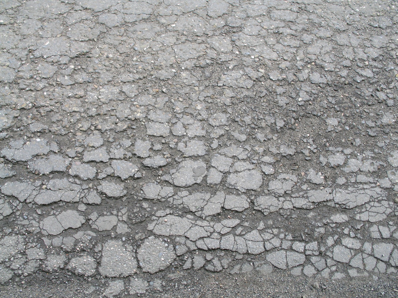
I wanted to erode the ground a bit, so I  found an damaged asphalt image from the internet:
Again I used the transform distort the change the perspective angle and setting the layer mode to Hard light so the colour of the layer below shows through. The purpose of this layer is to add detail. I also added some cracks on the door edge using the same texture. This is the result I have got:
What I did next was to distress the brickwork using some photos of broken brick, scaling them down and fitting them, so they compared with the rows and lining them up.
I changed the colour of the original bricks by clone brushing the new bricks on another layer and setting the layer mode to colour. After that I added a rust texture to the door to give it a more worn look. The rust layer was set on multiply. Also I added mould to the chair using photo reference and setting the layer on overlay.
 After that I decided to add a text to the door. To give it a more worn look, I made a layer mask and copied the rust texture into the layer mask, setting the layer mode to soft light. 
Finally I have colour graded the image by adding a gradient map adjustment layer setting it to dark blue through to light yellow. I have set the gradient map layer to Overlay and added a levels adjustment. I also added a gradient vignette at the top to give the image more atmosphere and lowering the opacity to 60% so the black is not so strong.
The final result you can see on the image below. I also added the original image, so you could see the difference. 


Thursday, 28 February 2013

Texture Tilling

Week Five
First, task we had, was to tile an image of a marble flour. This is my image:
After repeating the image 4 times I got a pretty nasty borders, because the darker parts weren't tilling correctly with the light. Next I duplicated the image and used the High Pass filter to filter the out the broader tones. It also removes some colour and contrast. After that I set the layer mode on Luminosity. That way the light and the dark of the diffuse are evenly spread and controlled but the High Pass filter.
However, I want to bring back some of the colour in the image and I do that by using the Levels, by pushing out the black to the right. This is the final result I got:
Second part of our task was to create a tilling treadplane floor from scratch. I started with a based metal texture and applying the same principles as the marble texture.  I created the pattern making two selections with the Marquee tool and inverting the selection,
removed the parts I didn't needed and the final result was I got an oval. To round out the shape
I used the Median, which soften's the edges without blurring them. Next, to create a good trade pattern I used the grid, which I set to 16 pixels, 1 subdivision. I then duplicated and rotated the tread until the texture was covert and the rotated the layer to 45 degrees to create a nice diamond pattern. 

 After that I decided to add a panted side panel that will run along the wall and doing a centre
section. For the panels on the side I used the grid, when duplicating the image it would tile correctly. Then I use the black stripes and just duplicated them filling them with yellow. I made a layer mask and added scratch's and dirt to, so it looked more realistic. In the end I did a specular map for it, to bring out some of the details.


 For the centre section I started by doing an outline using the line tool to create an angular pattern. After that I added some details to it to make it more interesting, also use the same principle with the side panel. I also did and Alpha for it give it the see through effect.
 
Finally, I did a normal map for the three element's, again using the overlaying method from the last task. Made a normal map, after that I duplicated the layer and set it on Overlay and using the Gaussian blur and copping until I got the result I wanted.


On the image below you can see the final result in Maya.