Week 6&7
In this post I will show some technique that we were show for photo manipulation and using channels.
I used the desert image we had from the presentation and load it in Photoshop.
.jpg)
I wanted to isolate the landscape and replace the sky with another image. So I went to the channels tab and selected the blue channel, because it offered a lot of contrast. I clicked on the blue layer, selected the how image and copied it and pasted it as a new layer in the layers pallette. After doing that I used the Curves tool to increase the contrast level of the blacks in the image. I had some grey areas in the back of the image, so by using the colour pick tool in the Curves tool menu, I selected all the grey's, which added a point on my curve and by dragging it I got rid of the grey in my image.
After that I copied my original image and used the black&white layer as a mask for the duplicate. I opened the mask layer and inverted the image, so my landscape became black and the sky white, which led to erasing the sky from the original image.
I opened a new sky image, copy and pasted this as a new layer below the foreground layer. I duplicated my canyon layer and opened the layer mask to do some editing. I wanted to preserve some of the foreground colours, so I made a marquee selection of the lower part of the mask and use the gradient fill to fade the bottom from black to white. I went back to my original image and used the Matching colour function, which sourced my current image and the cloud layer I used as my source layer. However, because of the layer mask the Colour match is affecting only the middle distance. The effect was I little bit too strong, so I dropped down the layer opacity down to about 70%, which helped to blend the colours.
This is the final result I got:

I sourced another image from the internet, so I could try the technique with a different desert landscape.


The first image is the original and the image below it is the result I got after applying the same methods.
The second task we had was to do photo manipulation to transform a reasonably run-down alleyway into a grim and dark alleyway. For the task I used the image from the tutorial:

First, I wanted to get rid of the water marks. For this I used the clone tool and the patch tool copying textures from the image until they were erased.

The next thing I did was to paint over the chair in light purple, because the red colour was I little bright and I didn't find in appropriate for the image. After that I set the layer mode to colour.

I also added a few cracks to the edge of the garage door and between the bricks and using a layer effect set to bevel emboss.

After that I substituted the windows for broken ones, using the free transform/distort to line up the vertical edges with my original image.

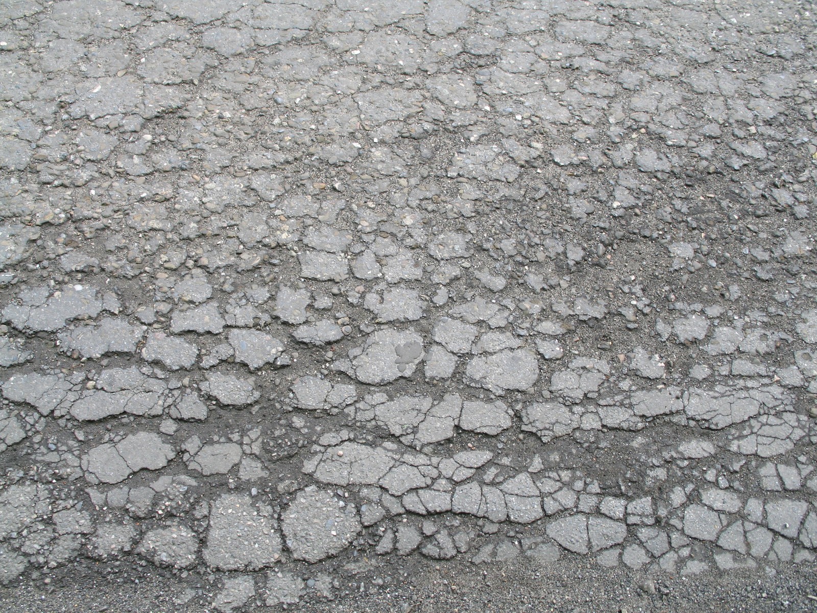
I wanted to erode the ground a bit, so I found an damaged asphalt image from the internet:
 Again I used the transform distort the change the perspective angle and setting the layer mode to Hard light so the colour of the layer below shows through. The purpose of this layer is to add detail. I also added some cracks on the door edge using the same texture. This is the result I have got:
What I did next was to distress the brickwork using some photos of broken brick, scaling them down and fitting them, so they compared with the rows and lining them up.

I changed the colour of the original bricks by clone brushing the new bricks on another layer and setting the layer mode to colour. After that I added a rust texture to the door to give it a more worn look. The rust layer was set on multiply. Also I added mould to the chair using photo reference and setting the layer on overlay.

After that I decided to add a text to the door. To give it a more worn look, I made a layer mask and copied the rust texture into the layer mask, setting the layer mode to soft light.

Finally I have colour graded the image by adding a gradient map adjustment layer setting it to dark blue through to light yellow. I have set the gradient map layer to Overlay and added a levels adjustment. I also added a gradient vignette at the top to give the image more atmosphere and lowering the opacity to 60% so the black is not so strong.
The final result you can see on the image below. I also added the original image, so you could see the difference.


No comments:
Post a Comment