Tuesday, 19 March 2013

Photo Manipulation

Week 6&7
In this post I will show some technique that we were show for photo manipulation and using channels.
I used the desert image we had from the presentation and load it in Photoshop.
 I wanted to isolate the landscape and replace the sky with another image. So I went to the channels tab and selected the blue channel, because it offered a lot of contrast. I clicked on the blue layer, selected the how image and copied it and pasted it as a new layer in the layers pallette. After doing that I used the Curves tool to increase the contrast level of the blacks in the image. I had some grey areas in the back of the image, so by using the colour pick tool in the Curves tool menu, I selected all the grey's, which added a point on my curve and by dragging it I got rid of the grey in my image.
 After that I copied my original image and used the black&white layer as a mask for the duplicate. I opened the mask layer and inverted the image, so my landscape became black and the sky white, which led to erasing the sky from the original image.
I opened a new sky image, copy and pasted this as a new layer below the foreground layer. I duplicated my canyon layer and opened the layer mask to do some editing. I wanted to preserve some of the foreground colours, so I made a marquee selection of the lower part of the mask and use the gradient fill to fade the bottom from black to white. I went back to my original image and used the Matching colour function, which sourced my current image and the cloud layer I used as my source layer. However, because of the layer mask the Colour match is affecting only the middle distance. The effect was I little bit too strong, so I dropped down the layer opacity down to about 70%, which helped to blend the colours.
This is the final result I got:
I sourced another image from the internet, so I could try the technique with a different desert landscape. 

The first image is the original and the image below it is the result I got after applying the same methods.
The second task we had was to do photo manipulation to transform a reasonably run-down alleyway into a grim and dark alleyway. For the task I used the image from the tutorial:
First, I wanted to get rid of the water marks. For this I used the clone tool and the patch tool copying textures from the image until they were erased.
The next thing I did was to paint over the chair in light purple, because the red colour was I little bright and I didn't find in appropriate for the image. After that I set the layer mode to colour.
I also added a few cracks to the edge of the garage door and between the bricks and using a layer effect set to bevel emboss.
After that I substituted the windows for broken ones, using the free transform/distort to line up the vertical edges with my original image.
I wanted to erode the ground a bit, so I  found an damaged asphalt image from the internet:
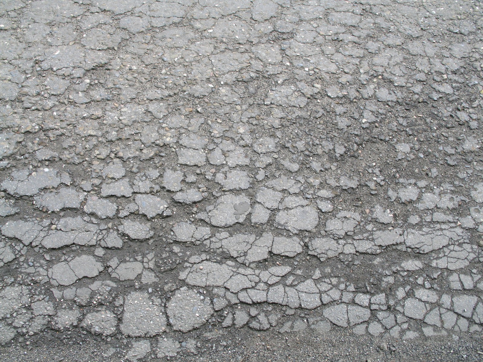
Again I used the transform distort the change the perspective angle and setting the layer mode to Hard light so the colour of the layer below shows through. The purpose of this layer is to add detail. I also added some cracks on the door edge using the same texture. This is the result I have got:
What I did next was to distress the brickwork using some photos of broken brick, scaling them down and fitting them, so they compared with the rows and lining them up.
I changed the colour of the original bricks by clone brushing the new bricks on another layer and setting the layer mode to colour. After that I added a rust texture to the door to give it a more worn look. The rust layer was set on multiply. Also I added mould to the chair using photo reference and setting the layer on overlay.
 After that I decided to add a text to the door. To give it a more worn look, I made a layer mask and copied the rust texture into the layer mask, setting the layer mode to soft light. 
Finally I have colour graded the image by adding a gradient map adjustment layer setting it to dark blue through to light yellow. I have set the gradient map layer to Overlay and added a levels adjustment. I also added a gradient vignette at the top to give the image more atmosphere and lowering the opacity to 60% so the black is not so strong.
The final result you can see on the image below. I also added the original image, so you could see the difference. 


Thursday, 28 February 2013

Texture Tilling

Week Five
First, task we had, was to tile an image of a marble flour. This is my image:
After repeating the image 4 times I got a pretty nasty borders, because the darker parts weren't tilling correctly with the light. Next I duplicated the image and used the High Pass filter to filter the out the broader tones. It also removes some colour and contrast. After that I set the layer mode on Luminosity. That way the light and the dark of the diffuse are evenly spread and controlled but the High Pass filter.
However, I want to bring back some of the colour in the image and I do that by using the Levels, by pushing out the black to the right. This is the final result I got:
Second part of our task was to create a tilling treadplane floor from scratch. I started with a based metal texture and applying the same principles as the marble texture.  I created the pattern making two selections with the Marquee tool and inverting the selection,
removed the parts I didn't needed and the final result was I got an oval. To round out the shape
I used the Median, which soften's the edges without blurring them. Next, to create a good trade pattern I used the grid, which I set to 16 pixels, 1 subdivision. I then duplicated and rotated the tread until the texture was covert and the rotated the layer to 45 degrees to create a nice diamond pattern. 

 After that I decided to add a panted side panel that will run along the wall and doing a centre
section. For the panels on the side I used the grid, when duplicating the image it would tile correctly. Then I use the black stripes and just duplicated them filling them with yellow. I made a layer mask and added scratch's and dirt to, so it looked more realistic. In the end I did a specular map for it, to bring out some of the details.


 For the centre section I started by doing an outline using the line tool to create an angular pattern. After that I added some details to it to make it more interesting, also use the same principle with the side panel. I also did and Alpha for it give it the see through effect.
 
Finally, I did a normal map for the three element's, again using the overlaying method from the last task. Made a normal map, after that I duplicated the layer and set it on Overlay and using the Gaussian blur and copping until I got the result I wanted.


On the image below you can see the final result in Maya.

Tuesday, 26 February 2013

Texture to Normal

Week Four
Hey, everyone this time I will show you how convert textures and make an usable normal map and a specular map to give the texture a little boost. So we had to make an cobble texture, but I decided to make a brick texture, because it was a little bit different. Before starting to do anything I had to convert the image to 16 bit, because we had to do a lot of blurring and on an 8 bit image you would probably get a banding in the texture. 
After that I use the offset to my texture reduced my texture by half, if the size of my texture was 1024 my offset is going to be 512. After the I got sharp edges in the texture and using the crop tool to sample bricks with similar colour to fix it and get the result you see on the top.
Next, I copied the texture to a new layer, so I could soften the high level detail and leave on the big shapes. I used the surface blur on the layer, however, the settings for every texture could be different, but the result you want is to soften the noise details and leave the large shapes intact.
After, I had to run the X normal, but get much better results and the bricks to pop out, I ha to duplicate the layer and apply 1- 3 pixels Gaussian blur and after that set the mode to Overlay. I repeated that until I was satisfied with how strong was the normal map. Then I selected all the layers and copied it to a separate layer and used the X- Normal Normalize, because of all the overlaying I have pushed the colours of the normal map beyond the limit and this way I corrected them. On the image below you can see the result of the final normal map.

After that I made a specular map of the diffuse. I made an greyscale of my original image and worked on it with the levels tool to darken them a little, because brick are not supposed to be shiny, even if they are new, they have a more matte colour to them and that is what I did. You can see on the image below.

We had to use the same principle's with the rock texture, which we did after that. You can see the diffuse, the blur, the overlay- blur normal map, the normalized normal map and the specular map.


And this is the final result of the textures rendered in Maya.

Tuesday, 12 February 2013

Sci- Fi Crate

Week Three

This week we had the task to concentrate on texturing than modelling. We were presented with a high poly and an low poly models done in Maya and the task at hand was to unwrap the UV's on the low poly object, also make a normal map, specular map and an Ambient occlusion from the High Poly mesh and apply them over the Low Poly mesh. It is shown on the two images below. On the first image you can see a snapshot of the UV's that I imported in Photoshop to help me with my diffuse map. The second image is taken from Maya in which you can see the High Poly mesh on the left and the Low Poly mesh on the right. 
 After the UV unwrapping it came time for the baking. The baking could be done in Maya, but also it could also be done in Xnormal. The reason we used Xnormal was, because the baking it self take's less time, whereas in Maya it takes a lot of time. I did my baking in Maya, because I was having problems with Xnormal and I got some pretty good results from Maya after a little bit of waiting. First, I baked my Normal map. I did it by make my objects the same size and putting the low poly mesh on top of the high poly mesh, so the program could get the information from the High Poly and apply it correctly on the Low Poly. After going through the settings and choosing the size of my Normal map, which in most cases in 1024x1024 and saving in as an Targa file, I pressed the baking button. However, before I did it I made sure that both my objects are visible and selected, so the program could find them, other wise some nasty results would have come out. You can see the final result on the image below.
After that I baked my Ambient Occlusion the same way I did with the Normal map. Ambient Occlusion is used to give you this shadow effect over the object and where two objects are going through each other. You can see it on the image below. 
After all the baking it came time to start working on my diffuse. I wanted to give the crate a nicely worn look, as if it's been knocked around in the cargo bay and while moving it around. I found a pretty nice based metal texture with scratch's.

Next I applied it over my AO, for which I made a separate layer and set it on multiply so it showed through the texture below. I was also looking at areas on the crate which would be likely to get scuffed and chipped and I then copied them with the Clone Tool to the right places using my Snapshot for a guide.
After that I wanted to add some symbols, text and other colours just so I could brake it into different parts and give it's own style. For the text I used a mask, which give me the opportunity to add a texture over the text just to give it that worn look. For the symbols and the strips I used the Polygonal lasso tool to get some good designs and played with the levels to give them worn- old paint. However, for the cross I used and image from the internet and applied the same principle.
For now it looked good, but I didn't look to realistic, so I decided to add another texture over it to make it look even more lorn out. But from this texture I only used the chipped areas but I needed them to be white so under Select Colour ranged a sample of the light grey and used the layer levels to make them even more whiter. You can see it on the image below, how I have applied it to the texture. 
Next I copied the texture and from it made and Specular Map. I started desaturating the colour of the text and the strips almost everything. While I was doing that I was thinking about the effect I wanted to give my crate and about the material beneath the paint.
Finally, I used the scratches of my texture and put them on one layer, I then opened the X-normal Height to Normals filter from the Filter menu. After lowering the Smooth Value I got the result I needed and had made a Bump Map. I put the Bump Map over my Normal Map while putting the layer on Overlay, so it showed through, but the bumps could still be seen. The image below show's the final result for the Bump Map.
 And here you can see the final result of my Sci- fi Crate I did for this week.

Nikolay Kolev- 2013 

P.S: Please comment on what you thing.